The products and services mentioned in this article may not be available in your region. Please reach out to customer support or your account manager if you have questions.
5 best data visualization tools for small businesses

Data has the potential to be a powerful tool to help small businesses achieve better results with limited resources. Thankfully, accessing data is no longer a challenge. Many affordable software tools now make that part easy.
Interpreting data, though, can be an overwhelming task, especially if you’re balancing multiple roles and responsibilities. That’s where business data visualization tools come in.
In this post, we’ll cover how to find and use the best data visualization tools for small businesses. Read on to learn:
What are data visualization tools?
Data visualization tools are software applications that translate data into visual formats to make it easier to understand. Small businesses can access data visualizations in 2 main ways:
- As an integrated feature within software products you already use
- By using standalone data visualization tools designed expressly for that purpose
In both cases, small business data visualization tools offer charts, graphs, and dynamic tables that will help you transform raw data into clear insights. With the help of these tools, you can:
- Customize dashboards that highlight key trends at a glance
- Devise more effective sales and marketing strategies
- Streamline inventory management and scheduling practices
- Design more expressive reports and pitch decks
- Infuse marketing content with engaging visuals
What makes a great small business data visualization tool?
When evaluating which data visualization tools meet your small business’s needs, consider a few main factors:
- Easy setup. Complicated tech products can require a slow onboarding process. Something you can start using right away—without the help of a dedicated tech or IT department—helps you gain insights faster, with less upfront effort.
- Intuitive design. You probably don’t have much time to learn how to navigate a complex, technical product. Look for a data visualization tool that’s easy to use from day one—especially if you don’t consider yourself a tech wiz.
- Customization options. Some tools provide specific types of visual reports or templates with limited customization options. That can make getting started easy but limit what you can do within the tool. If you want the ability to tailor reports to your particular needs, look for one with flexible customization options that let you control how your charts look and what types of data you can include.
- Mobile and desktop versions. A good mobile app lets you access data visualizations on the go, while a solid desktop version ensures that you can use a full keyboard and screen when you prefer. A tool with both options gives you the best of both worlds.
- Integrations. Seamless integration with the products you already use—like your POS system—enables you to get more out of the tool, with less work.
- Pricing. Data visualization tools can get expensive, but plenty are available at prices that are realistic for small businesses. Some data visualization tools even offer a free version—or at least a free trial—to give you a chance to try before committing.
- Customer support. When you have a question or problem, you want reliable assistance. Consider a company’s reputation for customer service, the kind of educational resources it provides, and what hours its team is available for support. Reading reviews is a great way to get to the bottom of this.
4 types of popular small business tools that include data visualizations
Most small businesses already have a sizable tech stack. Many of the software products you use for other purposes probably already track data for you and package it in visual formats—often automatically. Some of the best places to check for existing data visualizations are:
Customer relationship tools
Nurturing your customer relationships is a smart strategy for building loyalty and earning repeat business. Several types of customer relationship tools offer data visualizations, such as:
- Email marketing software. Email marketing software helps you stay in touch and build ongoing relationships with your customers. Most email marketing platforms provide data visualizations to help you track subscriptions, open rates, click-through rates, and unsubscribes.
- Customer relationship management (CRM) software. CRM products provide data visualizations that offer insights into customer acquisition numbers, customer retention data, and the typical customer journey.
- Customer service software. Customer service tools offer visualizations to help you interpret performance on customer service tickets based on metrics like time to resolution, first-response time, and customer survey ratings.
Marketing tools
Most marketing tools offer analytics as a standard feature and aim to package information in an intuitive format. Some common types of marketing tools with data visualization features are:
- Website analytics. Website analytics tools provide visualizations to help you understand how many people are visiting your website, how they find it, and their behavior once on it.
- Social media marketing software. Social media platforms and social media scheduling tools provide data visualizations to help you gain insights into your followers, impressions, engagement, and ad results.
- SEO tools. Search engine optimization software products include data visualizations to help you gauge trends in keyword popularity and competition, as well as your progress in earning rankings, links, and organic traffic.
- Online reputation management software. Online reputation management products sometimes offer data visualizations to help users track trends in their online mentions and reviews.
Operations tools
Many of the tools you use to keep your business running efficiently also automatically track data around your operations. You can often find data visualizations available in your:
- Inventory management software. Inventory management products offer data visualizations to help users stay on top of stock levels and understand trends in how often items sell and run out.
- Accounting software. Accounting tools provide visualizations to help businesses understand the relationship between earnings and expenses, and spot trends in each over time.
- Human resources (HR) software. HR tools offer visualizations of data related to your employees. This might include information around staffing, onboarding, payroll, benefits, scheduling, performance management, and training and development.
Sales tools
Understanding sales trends is crucial for making data-driven decisions to increase profits. Sales tools that collect data and create visualizations from it include:
- Point-of-sale (POS) systems. Many POS systems automatically generate visualizations for sales data such as the amount you make in sales, number of purchases, and average order size.
- Third-party delivery platforms. Third-party delivery platforms like Uber Eats provide data visualizations about the number of sales made through the platform, how many repeat customers you earn, and customer satisfaction ratings for delivery orders.
Best data visualization tools for small businesses
You may find that the tools you already have provide all the data visualizations you need, but you also have the option to seek out tools specifically designed for creating data visualizations. Some of the best small business data visualization tools to consider include the following list.
1. Tableau
Tableau bills itself as the “world’s leading analytics platform.” The tool offers features for creating, editing, and sharing data visualizations. You can use a fully cloud-hosted version of Tableau that allows you to access the visualizations you create from anywhere and easily share them with other members of your team. You can also opt for the desktop version that’s downloaded locally to your computer.
Why Tableau is great for small businesses
Tableau’s interface and features are designed for a general audience—not just data scientists. You can build visualizations using intuitive drag-and-drop features, and the company offers extensive educational resources about how to use the product effectively. Tableau has also incorporated an AI tool called Einstein into the product that can help with statistical modeling and answer questions using natural language.
Pros of Tableau
- Offers many educational and training resources, including pre-built dashboards, training videos, and an active community of users
- Offers cloud and desktop versions, along with a mobile app
- Includes collaborative features so that teams can work together
- Promises enterprise-grade security
- Integrates with many business products, including Microsoft Office applications, Google products, and Salesforce
- Offers a free trial
Cons of Tableau
- Some users find that it has a steep learning curve
- Some small businesses may find it too pricey, especially if you have a lot of users
- Customer support is limited
What Tableau costs
Tableau offers a free 14-day trial. After that, the company charges per-user rates that start at $15 a month.
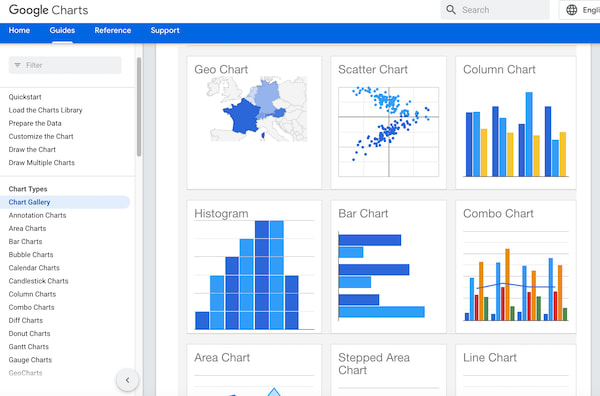
2. Google Charts
Google Charts is a free data visualization tool from one of the most familiar names in the business world (and the world at large, for that matter). Google Charts is a cloud-based software tool that lets businesses easily create a wide range of data visualizations, including charts, graphs, maps, tables, and more.
Why Google Charts is great for small businesses
Google Charts is a good tool for small businesses because of its hard-to-beat price (free) and its association with a brand most businesses already have a relationship with. Google Charts provides a gallery that shows all the available chart types to choose from. You can select the data format that best fits your needs, then customize it with your own data. The main catch is that to use it requires some basic knowledge of coding and data science.
Pros of Google Charts
- Free and accessible
- Comes from a trusted brand
- Offers multiple chart formats
- Includes animated and interactive chart options
- Can integrate with many data providers (any that use the Chart Tools Datasource protocol)
Cons of Google Charts
- Designed for developers
- Requires basic coding knowledge
- Integrations are possible but require coding knowledge to set up
- No offline option
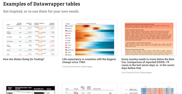
3. Datawrapper
Datawrapper is a data visualization tool that powers the creation of 3 main types of visualizations: charts, maps, and tables. It’s free to use and doesn’t even require an account, so there’s no barrier to trying it out.
Why Datawrapper is great for small businesses
Datawrapper was initially built for journalists. That means it was designed with a nontechnical audience in mind. It’s intuitive to learn and doesn’t require any coding knowledge. On the other hand, that also means it won't have certain business-focused features that are common in some other options on the list, like easy integrations with business tools.
Pros of Datawrapper
- Free, with no signup needed
- No coding or design skills required
- Offers unlimited visualizations
- Provides educational resources for learning the tool, including an online academy, webinars, and customer support
Cons of Datawrapper
- Doesn’t integrate automatically with other products; you have to import data manually
- Designed for journalists, so available resources aren’t all relevant to small business users
What Datawrapper costs
It offers a free plan, which is the best option for small businesses. There is also a paid plan with extra features at $599 a month, but it won’t be relevant to most small business users.
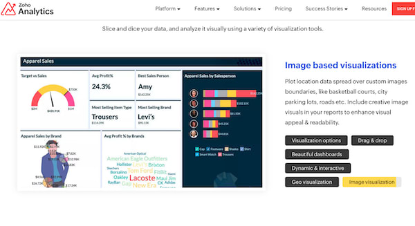
4. Zoho Analytics
Zoho Analytics is an analytics platform built to bring data from various sources together in one place. This can make it easier to see the big picture of your business.
Why Zoho Analytics is great for small businesses
Zoho Analytics easily connects to many of the data sources small businesses commonly use, including Microsoft Office products, Mailchimp, and QuickBooks. In addition to enabling users to create data visualizations like charts, graphs, and widgets, you can incorporate those visualizations into custom dashboards and reports.
Pros of Zoho Analytics
- Offers extensive integration options
- Automates data synchronization with connected data sources
- Has an intuitive drag-and-drop interface
- Includes an automated AI assistant to help with data analysis
- Has a desktop version and a mobile app
Cons of Zoho Analytics
- The connections to other products and apps aren’t always reliable
- Reviews that mention customer service are mixed
- The paid versions can get expensive
What Zoho Analytics costs
Zoho Analytics offers a free plan that will meet the needs of many small businesses. If you find that you want more features or users, paid plans start at $24 a month for up to 2 users.
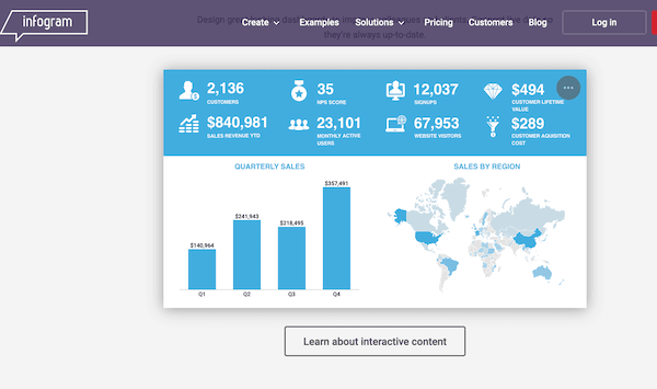
5. Infogram
Infogram is a visualization tool designed to help businesses create public-facing content (like infographics and interactive charts) and internal data visualizations (like reports and dashboards).
Why Infogram is great for small businesses
Infogram works well for multiple functions. In addition to using the software to make sense of your internal business analytics, your marketing team can use it to turn data into attractive visual content for promoting your business. Infogram provides pre-built templates to help you jump-start the process of creating data visualizations. It also includes features that allow you to make your visualizations and reports interactive.
Pros of Infogram
- Offers a collection of templates, which provide an easy starting point
- Has an intuitive drag-and-drop editor
- Includes features to enable collaboration
- Integrates with common data sources like Excel, Google Drive, and Dropbox
- Also integrates with platforms for sharing content, like YouTube and SlideShare
- Automatically tracks metrics for interactive content, to help measure engagement
- Works on desktop and mobile
Cons of Infogram
- The free version is “only intended for non-commercial use,” according to Infogram, so businesses must plan to pay for a premium option
- No free trial for the paid version
- Works only with an Internet connection
What Infogram costs
There is a free version, but it’s not meant for business use. The paid versions start at $19 a month for one user. Plans that allow multiple users to collaborate start at $149 a month.
How Uber Eats makes it easy to understand your business data
Small businesses that work with Uber Eats have access to an array of data visualizations within the platform. The visualizations in Uber Eats Manager reveal insights about:
Customers. View visualizations that reveal the total number of customers for a time period, customer retention, and how customers rate their experience with your business and products.
Menu. Access a conversion funnel to help you understand which items are ordered most often and how customers rate specific menu items, so you know how each item affects customer satisfaction.
Sales. See sales data—including your total number of sales, and categorized by hours and specific items—conveyed visually.
Operations. Use visualizations to understand the frequency of order issues, common issue types, and the hourly breakdown of when they happen.
Marketing. Gain intel into the success of your marketing efforts with visualizations that convey the level of engagement your ads receive, as well as your return on investment for each campaign.
Businesses that are already working with Uber Eats can log in to Uber Eats Manager and navigate to the Performance tab to explore your data in more detail. If you haven’t partnered with Uber Eats yet, sign up to start reaching new customers, expanding your delivery coverage, and taking your business further with insights you can act on.
Services
Services
Technology
Manage orders
Simplify operations
Grow your sales
Reach customers
Who we serve
Who we serve
Pricing
Resources
Customer Hub
Learn
Contact us