The products and services mentioned in this article may not be available in your region. Please reach out to customer support or your account manager if you have questions.
What is data visualisation? 8 essential types for businesses
With the growing availability of affordable software tools, small businesses find themselves with access to huge amounts of business data. But having access to this information isn’t the same thing as really understanding it. For your business data to have value, you need to analyse it effectively.
One of the best ways to achieve that is with the help of data visualisation. In this article, we’ll explore data visualisation in more detail by diving into the following topics:
What is data visualisation?
Data visualisation is the practice of translating data into visual formats that make the information easier to understand. For many people, turning numerical data into visual charts and graphs helps you process what you’re seeing – you can spot trends and changes in data over time and see how different data sets relate to one another.
As access to data has grown in recent years, so has the availability of tools with data visualisation features. Small businesses will find that many of the products you have for other purposes will also include some forms of data visualisation. These products may include:
- POS (point-of-sale) systems
- Third-party delivery platforms
- Marketing software
- Accounting software
- Inventory management software
For anything your tech stack doesn’t already cover, creating new data visualisations is now easier than ever with user-friendly data visualisation tools.
The importance of data visualisation in business
Data can empower you to make smarter business decisions. In a 2022 Foundry survey, 63% of businesses said they’ve launched new revenue opportunities or lines of business because of what data and analytics showed them. But data is only valuable if you’re able to make sense of it first. In the same survey, businesses named data reporting and visualisation capabilities as the most important features they look for in an analytics product. With access to data visualisations, you can:
- Increase business intelligence. Gain insights into your current business processes and identify opportunities for improvement.
- Optimise sales and marketing campaigns. Measure the success of different marketing and sales campaigns and shift investments to those with the highest return on investment.
- Add revenue streams. Identify new product opportunities based on customer interest.
- Streamline operations. Predict sales trends and match staffing and inventory needs accordingly.
- Improve the customer experience. Gain insights into what customers like so you can better meet their expectations.
- Strengthen customer service. Track common customer service issues and improve products and support resources to address them.
Data visualisations help you remove the guesswork from running your business and base your business strategy on tangible evidence.
Different types of data visualisations
Data visualisations come in many formats, each suited to different types of datasets or goals. Using the right data visualisation for the job will help you maximize your business data. For most small businesses, these are some of the main types of data visualisations you’ll encounter:

Bar chart
A bar chart, sometimes called a bar graph or column chart, is a great way to compare different categories of data. Bar charts have a horizontal axis and a vertical axis (often called the x axis and y axis, respectively), each representing a different type of value—for example, one might show sales volume and the other dates, as in the first graphic below. Looking at your data in this way can help you spot trends and make comparisons.
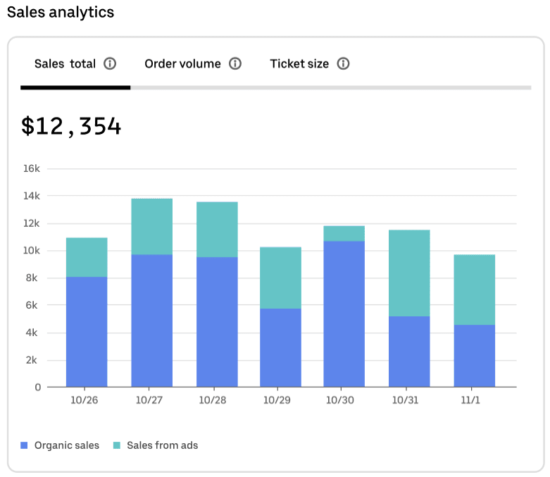
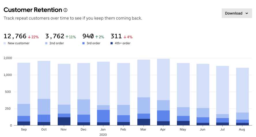
You can get even more insights from a bar chart by using a stacked bar chart, which plots several related data points onto a single bar to make it easier to see how they stack up. The first chart below, for example, not only shows total sales by date but also makes it easy to see how many sales came from organic search compared to ads. And you don’t have to stop at charting just 2 values in each bar. The customer retention data visualisation below uses 4 colours to help business owners track how often customers return, broken down by month.

Pie chart
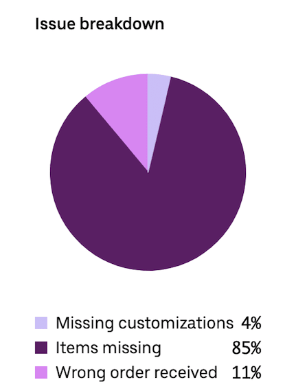
Pie charts use a circular shape to illustrate quantitative data. Each slice of the pie represents a proportionate part of the whole. The slices visualise percentage data that adds up to 100%.
The pie chart below provides a breakdown of the most common issues customers report with delivery orders. Seeing the visual difference between 85% (items missing, in this case) and 11% (wrong order received) can clarify the relative scale of each kind of error and help the business prioritise which strategies to emphasise to reduce overall issues.

Line graph
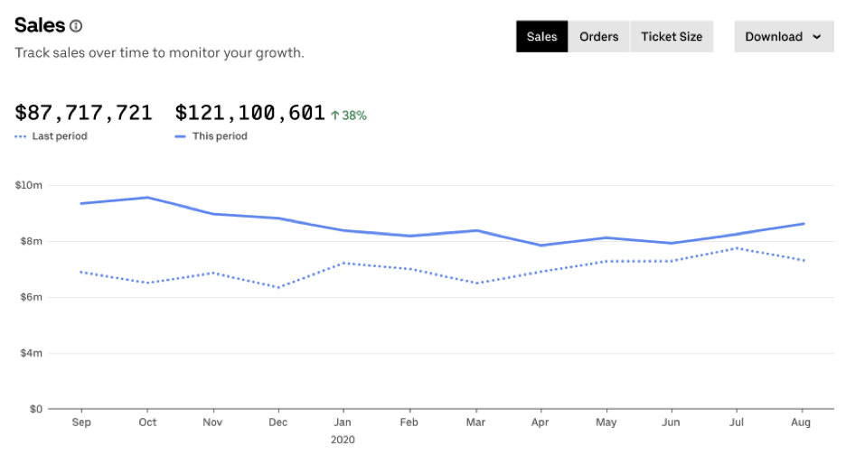
Line graphs show the progression of data over a period of time. Like bar graphs, they include a horizontal (x) axis and vertical (y) axis. The horizontal axis is used for units of time, such as months, days or years. The vertical axis can be for any quantitative type of data you track, such as the amount made in sales, number of orders or average ticket size. Line graphs help you see how results have changed in a set time period and identify notable trends in any peaks or valleys in the data.
As shown in the line graph below, you can plot more than one line on your graph to see the relationship between multiple datasets. In this case, the graph shows how sales numbers compare for 2 different years. You could also use this kind of data visualisation to compare your numbers versus industry averages or compare the results from 2 store locations for the same time period.

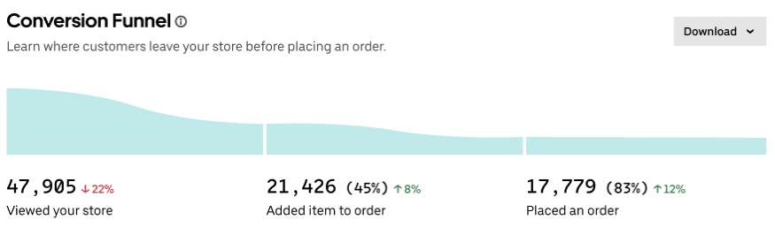
Funnel chart
A funnel chart is a useful tool for visualising data that shows a progression over sequential steps or stages. For businesses, funnel charts are a common form of data visualisation for displaying the buyer’s journey, or the likely steps a consumer will take from first learning of your brand to becoming a long-term customer.
Funnel charts can help you track how well your marketing and sales process is moving your audience through to different stages. With a conversion funnel visualisation, like the one shown below, you can identify if there’s a particular step in the process where you tend to lose customers. If the funnel shows a notable drop-off between adding items to a cart and placing an order, that suggests there’s some issue stopping customers from taking that final step, like a high delivery fee or long wait time. By revealing a potential problem, a funnel chart can help you diagnose the issue and fix it.

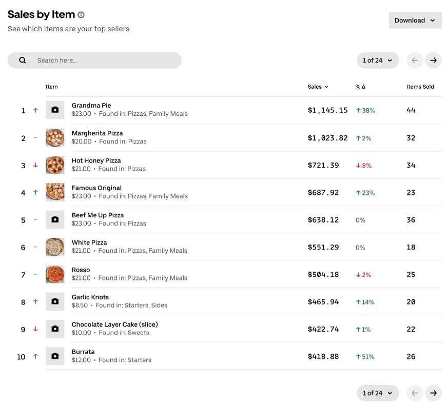
Table
Tables let you line up a list of data points in rows and columns and sort them as needed. Sorting is a handy feature for getting a fresh perspective on the data in a table. You can easily rearrange your data based on different questions you might have. For example, you can quickly sort by the top-selling item to work out your most profitable products, or see which items have the biggest change in sales to measure how a promo went.
As shown in the table below, you can use colours to help show an increase (green) versus a decrease (red) in the data, and you can use images to remind you what the numbers in each row refer to. Seeing pictures of your most popular items in a list next to the relevant data can make it easier for you to take in.

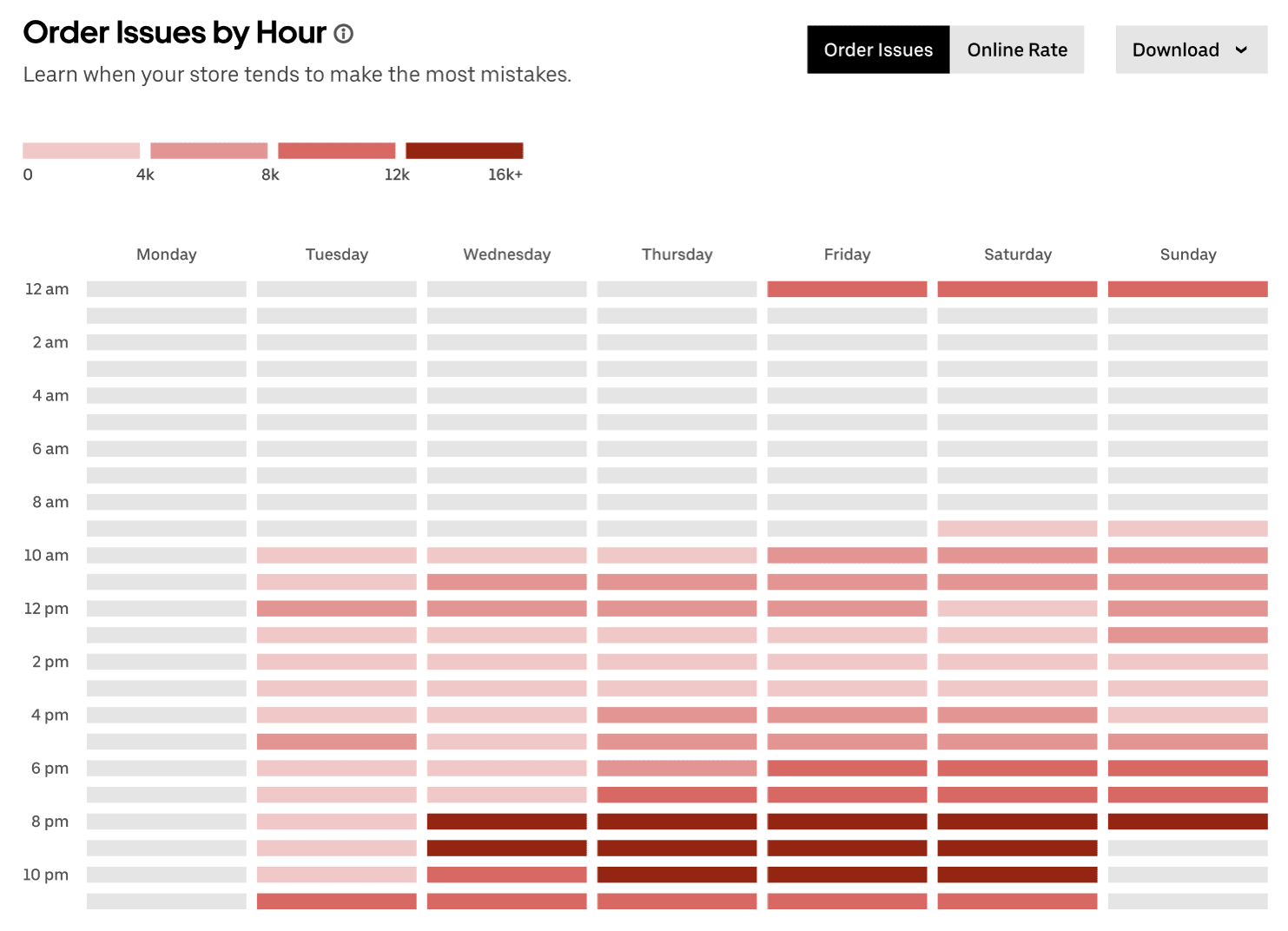
Heat map
Heat maps use colour gradients to show quantity or intensity. Their formatting can differ. A heat map might be in a table-like format as shown in the example below, which uses the two axes to break down the number of order issues by day of the week and time of day. You might also see website heat maps that measure how different parts of a webpage attract visitors’ attention.
Another common version is a heat map that uses a geographic map to show how the distribution of something varies across locations. Geographic heat maps are often called dot maps or distribution maps. Small businesses could use a dot map to understand where most of your customers are located, to help make decisions about your delivery area or where to open new locations.
While the look of heat maps can vary quite a bit depending on the format used, a common feature is using different shades of colour to make a point. In the heat map below, the darkest shades of red highlight the times when the business sees the most order errors—the red is a deliberate choice, as it signals an issue to be aware of.

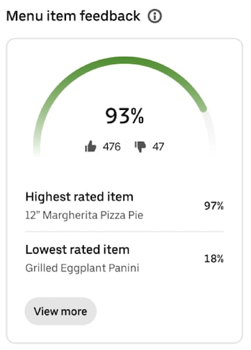
Gauge
A gauge is a data visualisation that takes the form of a half-circle to illustrate a percentage. Gauges are often used to show progress toward a goal. You’ve probably encountered them in a fundraising context before.
A gauge can help provide a simple snapshot of how well you’re performing in a particular area. In the example below, a business can quickly see what percentage of customers are happy with the items they’ve received. They can also dig into that data to see at a glance how customers feel about specific items.

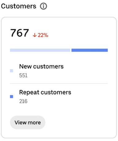
Percentage bar
A percentage bar is another way to show percentages visually. Instead of a pie or a gauge, you can use colours applied to a bar format to better highlight proportions or comparative data that add up to 100%.
Percentage bars are usually used to either:
- Show how close a data point is to reaching 100%, similar to what you’d do with a gauge, or
- Show the comparison between two data points that add up to a whole, like in the example below that shows the relative share of new and returning customers
Percentage bars are a pretty straightforward type of data visualisation that can help you make more sense of small datasets.
Grow with analytics and insights from Uber Eats
By signing up with Uber Eats, you’ll have access to valuable data visualisations in your Uber Eats Manager dashboard, a centralised hub for managing your business.¹ This one-stop shop will provide you with tools to monitor and optimise your performance, broken into the following categories:
Analytics: Dive into data around your customer groups, sales and operations.
Feedback: Read customer reviews, menu item feedback and delivery handoff ratings.
Insights: Compare your performance with a group of similar storefronts, and receive personalised recommendations on how to improve.
Reports: Request reports for the time frame you need, and download granular data in a versatile CSV file format, to be used in your own analytics.
If you’re an operator on the move, you’ll also be able to download the Uber Eats Manager mobile app and opt in to receiving real-time notifications tied to your store’s performance and operations.
For businesses already working with Uber Eats, log in to Uber Eats Manager and navigate to the Performance tab to explore your data in more detail. If you haven’t partnered with Uber Eats yet, the path to better data visualisation starts with signing up.
Info and inspo to grow your business

Discover best practices to help your business market effectively, operate efficiently and deliver seamlessly.

Explore articles, guides, product updates and other resources to help your business grow.

Learn how businesses leverage the Uber platform every day to expand their reach and strengthen their brand.
¹For non-restaurant retailers, Uber Eats Manager availability is subject to region and fulfilment method
Solutions
Business types
Business types
Resources
Resources